
Data bootstrapping and facing my mortality


TL;DR:
Use bootstrap if you have a small dataset (e.g., n = 30) and want to guess how it performs in a bigger setting (e.g., n = 300,000) without spending the time and money to test the bigger data set.
Here’s an example dataset of climber’s age: [{ name: Joe, age: 24}, {name: Mary, age: 30}, …… {name: Ryan, age: 21}, {name: Bob, age: 43}]
Determine the metrics you’re looking (e.g., mean age)
Randomly draw 30 samples from the dataset. One entry could be drawn more than once (e.g., {name: Joe, age: 24} could be drawn multiple times). The nerds call it Sampling with Replacement.
Do that many times. I usually start with 3000 and increase as I get a smooth cumulative distribution curve.
I pick the mean at 2.5 and 97.5 percentile to remove potential outliers, and see what values the mean might fall in between if I have a lot more data
Here’s the link to Github: https://github.com/polygoatme/data_science_blog/tree/main/bootstrap
Below is a more detailed breakdown of the concept.
Prelude:
I was first exposed to this technique when I worked at a medical device company. Our data scientist used it to guess how our device would perform with a larger group of patients. We ran a study with 30 patients. By randomly picking data from these entries 5,000 times, he came up with some guesses as to how this device would perform when distributed to 100,000 patients.
Setup:
One of my frustrations when it comes to learning data science and statistics is that the context is usually incredibly boring. How many times do I have to work with stock or Iris data before bleeding from my eyeballs? Below is my attempt to use this technique for a data/outcome that I can relate to.
I really enjoy rock climbing. As I’m getting older, my quarter life crisis is starting to sink in. Expecting my health to steadily decline, I’m beginning to wonder how many years I have left before fantasizing about applying WD40 to my joints. I thought I’d use the same technique to see how long I have left in my climbing career.
Dataset Overview:
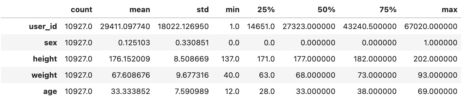
I saw a cool dataset on Kaggle created by David Cohen. It shows a climbers’ age and the difficulty of the routes they last climbed. There are also other features that I don’t care too much about. A total of 10,927 climbers contributed their information. To see the effectiveness of the bootstrapping, I separated the data into two sets. One is for bootstrapping, or training, which includes 38 climbers’ data. The other will be the entire, or actual dataset to see how accurate the bootstrapped data is.
Execution:
I used python alone with Numpy and Pandas library to approach this method. Both Numpy and Pandas are used for processing arrays—lists of data. However, it should be possible with any tool once you’ve understood the basic principle.
Feel free to follow along by downloading the code from Github: https://github.com/polygoatme/data_science_blog/tree/main/bootstrap
Whenever I get a dataset, I like to explore and see what the data looks like. The first couple of methods I like to call are shape and head. Shape tells me how many columns and rows we have. Columns tell me the features, such as age and grade. Rows tell me the total number of entries. The head method shows me the columns and first few rows, so we know what the data look like.
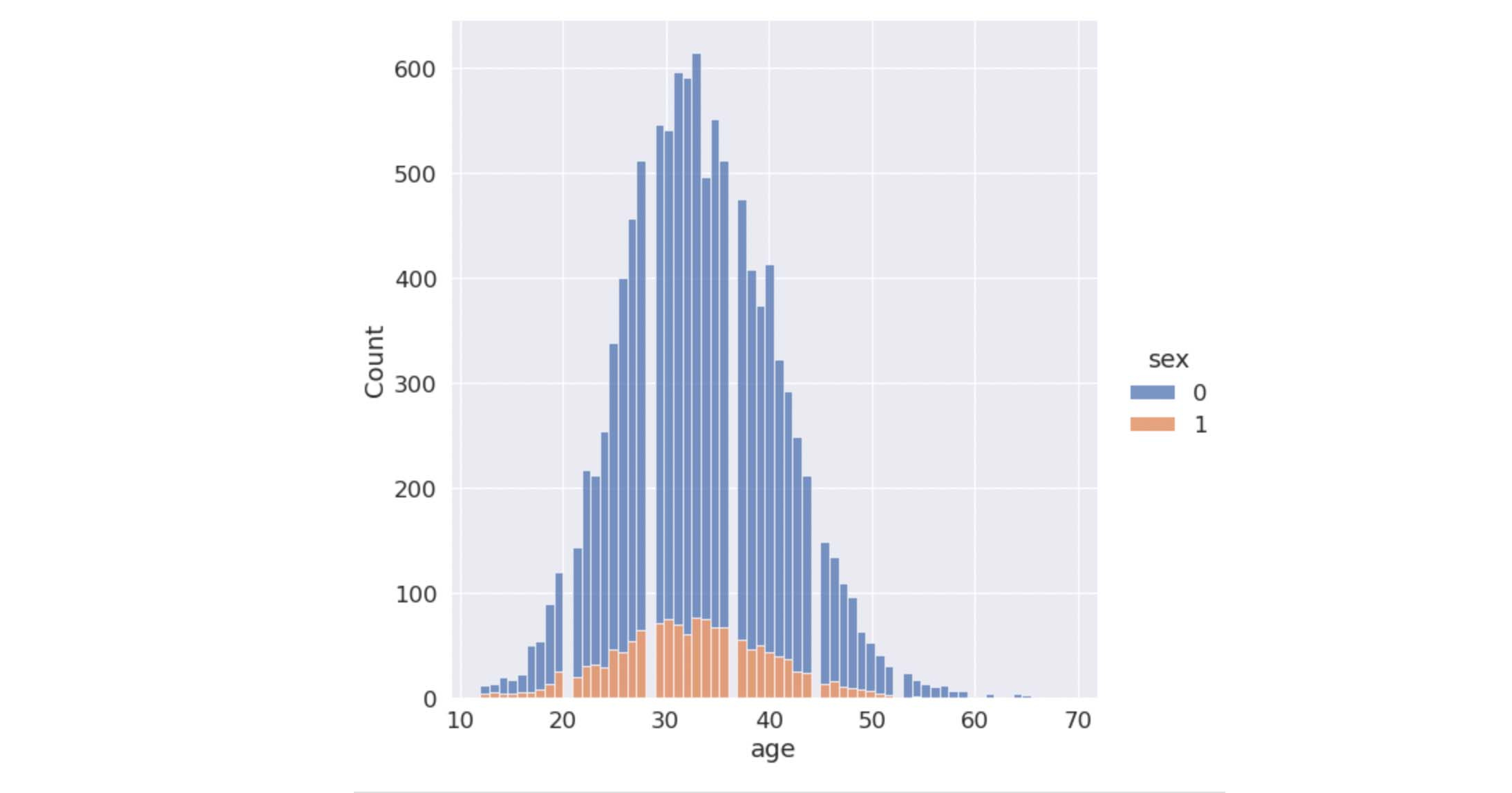
After getting a brief overview of the data, I like to plot them out to see how these data are distributed.
Then I like to call describe, which gives us some basic metrics such as mean, standard deviation and percentile.

Once I understand the data, I can start bootstrapping. I got my bootstrapping subset by randomly selecting 38 out of 10,927 entries. For the sake of reference, I’ll call it bootstrapping data.
I ran the loop 5,000 times. In each iteration, I draw a random sample with 38 entries from bootstrapping data, and get the mean of those entries. Then I save these means to a list.
I’m not sure if this is necessary, but I like to see a cumulative distribution graph to see the overall probability of the means. In this case, cumulative distribution shows me how likely a mean would fall under a specific standard deviation. From this graph, I can see that the true value most likely falls between 28 and 36.
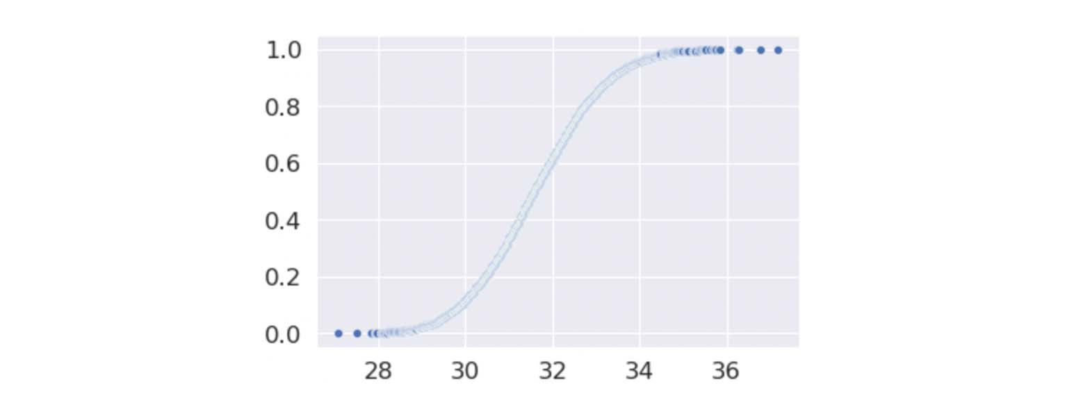
I can also see this by getting the data from around 2.5 to 97.5 percentiles.
The mean of the original data is 33.3, and the confidence interval is between 33.19 and 33.48. I’d say that’s a pretty reasonable guess.
Parting thoughts:
This technique is really nice when it costs a lot to build and distribute a product or service, and you want to analyze and predict the outcome of how it would perform in a larger group of people by gathering detailed metrics from a small group of people. If you have ever used this technique, I’d love to know the context.
Disclaimer:
I’m not an expert. I’m just here to share my process of learning and understanding, please take the information with a grain of salt. If you see something that’s messed up, please leave suggestions or corrections in the comments. I’d really appreciate it.